Preliminary sketch (first cover) with final cover below.
New website, new covers added.
Two books covers won in Communication Arts Design Annual 2020. Turkish translation of Men in Space by Tom McCarthy and Rushes From the River Disappointment by Stephanie Roberts.
Jacket with printed case binding below.
Turkish translation of A High Wind in Jamaica by Richard Hughes.
Cover lists of all of Bronwen Wallace’s published poems.
Jacketed cover with cloth below.
Final cover with preliminary below.
Just arrived in the mail. Matte lamination overall with spot gloss on ceramic elements.
Four books that were part of the Vehicle Press 2019 spring launch in Toronto and Montreal.
5 of my covers were selected for the 2019 Association of University Presses Book, Jacket, and Journal Show. Thanks to the AUP, the judges and the committee for making this show possible. Special thanks to my incomparable Art Director, Elena Goranescu from McGill Queens University Press. All the selections can be seen at design.up.hcommons.org.
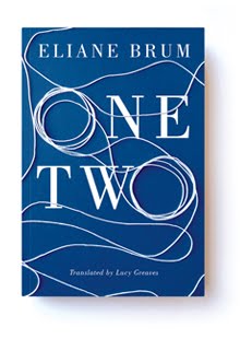
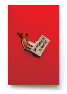
Cover design for Farrar, Straus and Giroux. AD: Na Kim
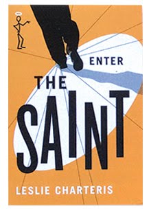
This is the seventh cover I have done for Sale Press for the John Christopher novels. The others are below.
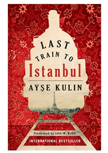
Turkish translation of Men in Space by Tom McCarthy
These covers have won in Communication Arts Design Annuals going back to 2000.
My work space
An intellectual is someone who says a simple thing in a difficult way; an artist is someone who says a difficult thing in a simple way. –Charles Bukowski
When I am working on a problem, I never think about beauty but when I have finished, if the solution is not beautiful, I know it is wrong. –R. Buckminster Fuller
A lot of people try to think up ideas. I’m not one. I’d rather accept the irresistible possibilities of what I